
Findings & Successes
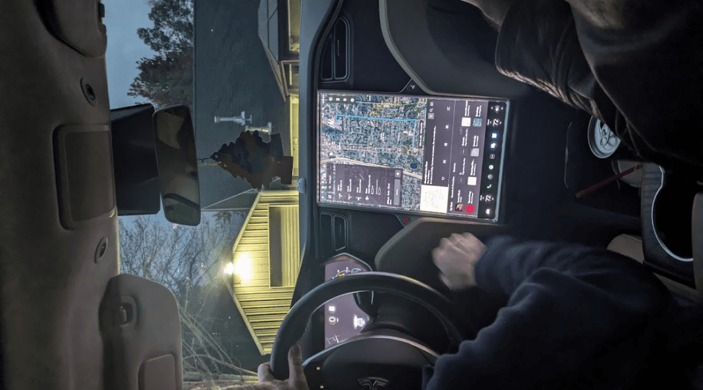
3 out of 5 participants voiced concern to take eyes out of the road to use touch screen.
40%
60%
Easy to understand
Unclear
Are the icons and layout of the climate controls easy to understand?
Question asked: Do you prefer to change the temperature using the touch screen or steering wheel?
All Testers Prefer to use steering wheel physical controls
100%
Do you like to make climate or navigation changes while parked or diving?
Parked
1
2
3
4
5
Driving
80%
20%
Affinity Mapping Insight
Suggest Likert Scale for Further Insight
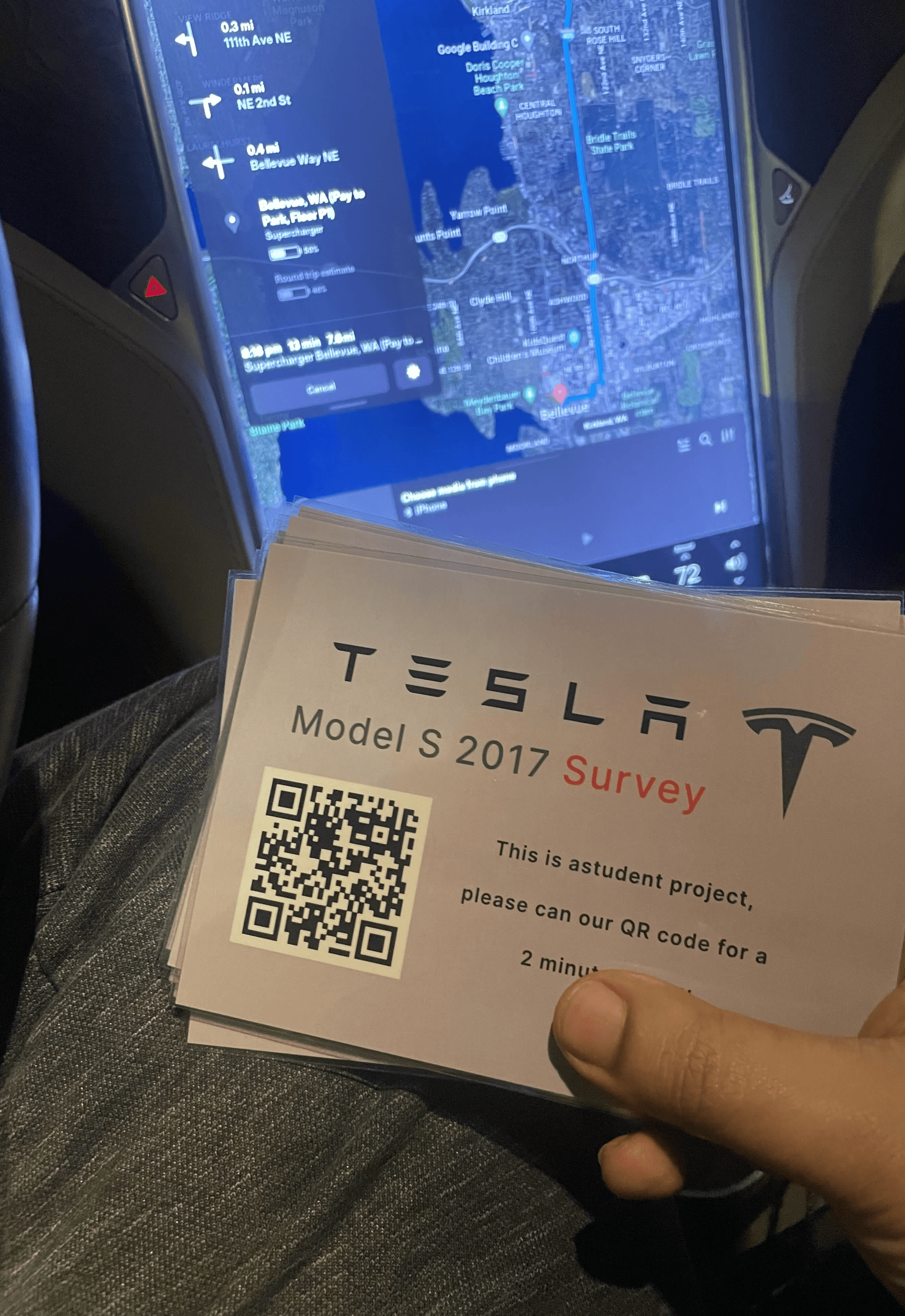
Data taken from inexperienced and experienced users

With the data gathered from our user testing, we utilized the affinity mapping method to organize and interpret the data collected from our participants. This visual sorting technique allowed us to cluster user observations, comments, and feedback into groups and themes, providing a comprehensive overview of user interactions and experiences with the system. We then began to look for common themes and trends in the data.
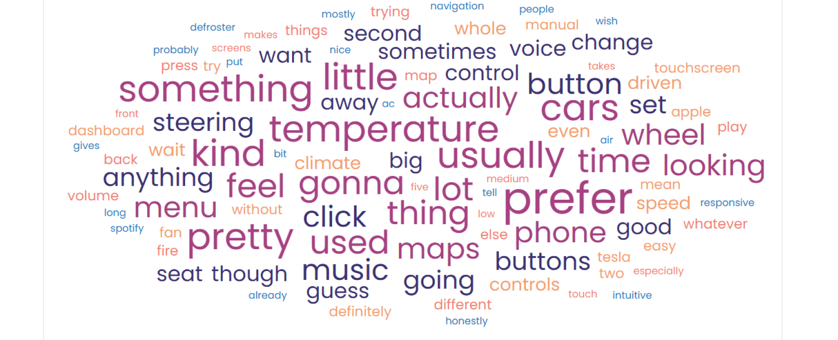
We created a word map to see what words were brought up most often. We noticed that people had a lot more feedback on the climate control system rather than the navigation. Words describing the physical button interactions were more common than other ones. We noticed that people often compared the interface to apple in similarty. Spotify was mentioned several times as someones way to play music in the navigation test but they often had issues. Speed, Responsiveness, and manual were all commonly found descriptors for the test.