LG WebOS Redesign
LG has been using and updating their smart TV Operating System since 2014. It is constantly evolving to meet the needs of the ever changing streaming and media landscape. LG has continuously pushed the envelope in the smart TV space introducing new features and great UI in the industry.
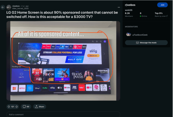
Their WebOS platform takes up a small sliver of the market but is growing and is continually praised for its UI features. We will be taking a look at common pain points from user experiences and user research
Project Scope
Chapter 1: Research Identify User Pain Points
Create a more effective visual design while addressing five or more user pain points.
Chapter 2: Execution and visual direction
Creating more effective UI design can be used to address user pain points by improving clarity, enhancing usability, increasing accessibility, and boosting aesthetics. This Redesign will take the following approach
Chapter 3: Test and Analyze
Chapter 4: UI guide: Style Guide + Revised Mockups
Chapter 1: Research
Common themes on forums and reviews
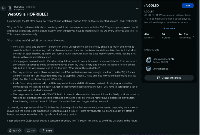
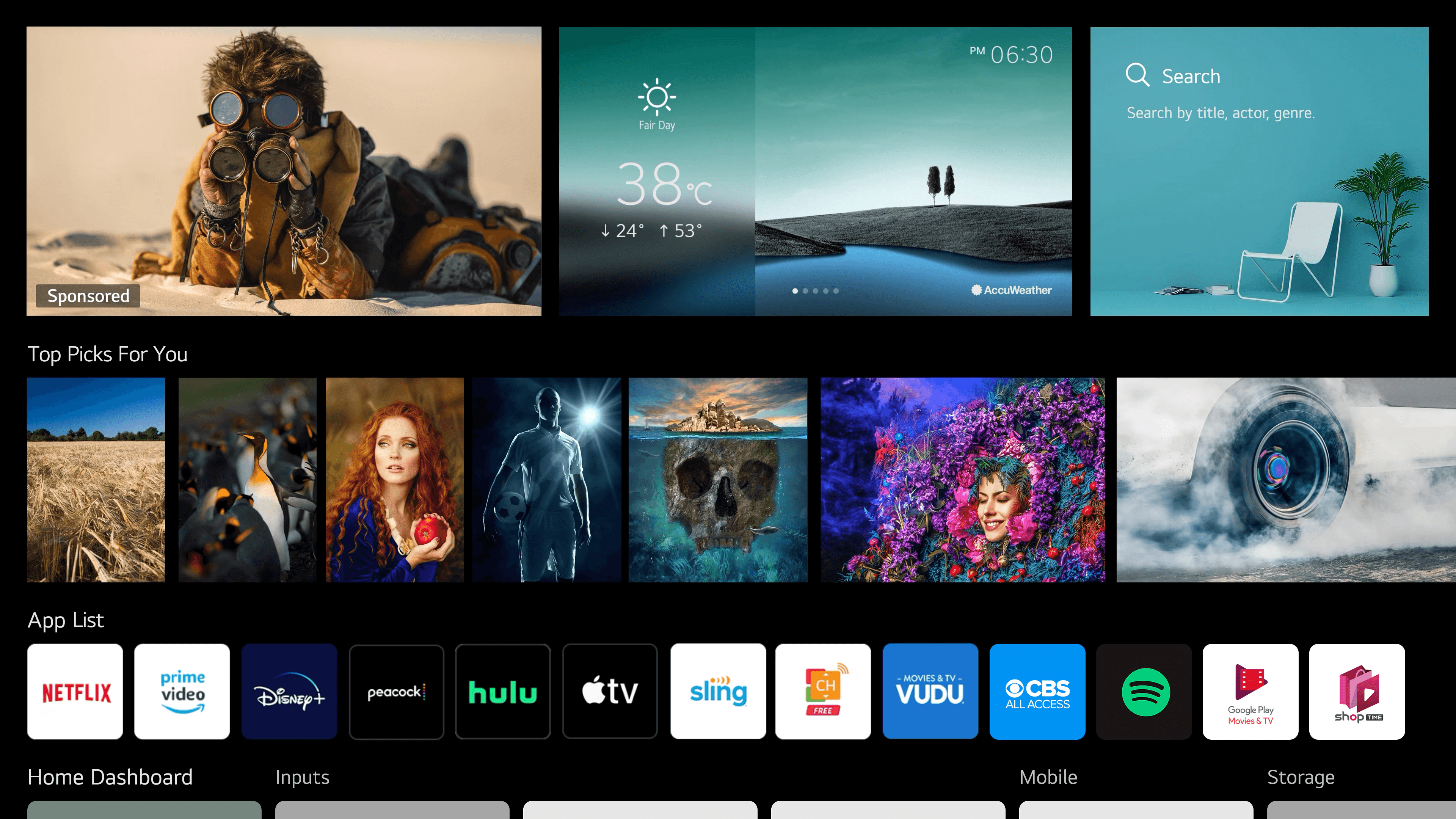
Use of Ads
User Profiles
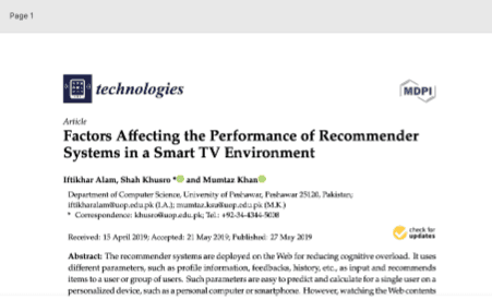
Notable Research Data
Pain Points
Possible Solutions
Chapter 2: Visual Direction
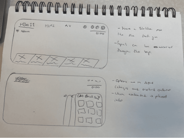
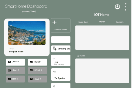
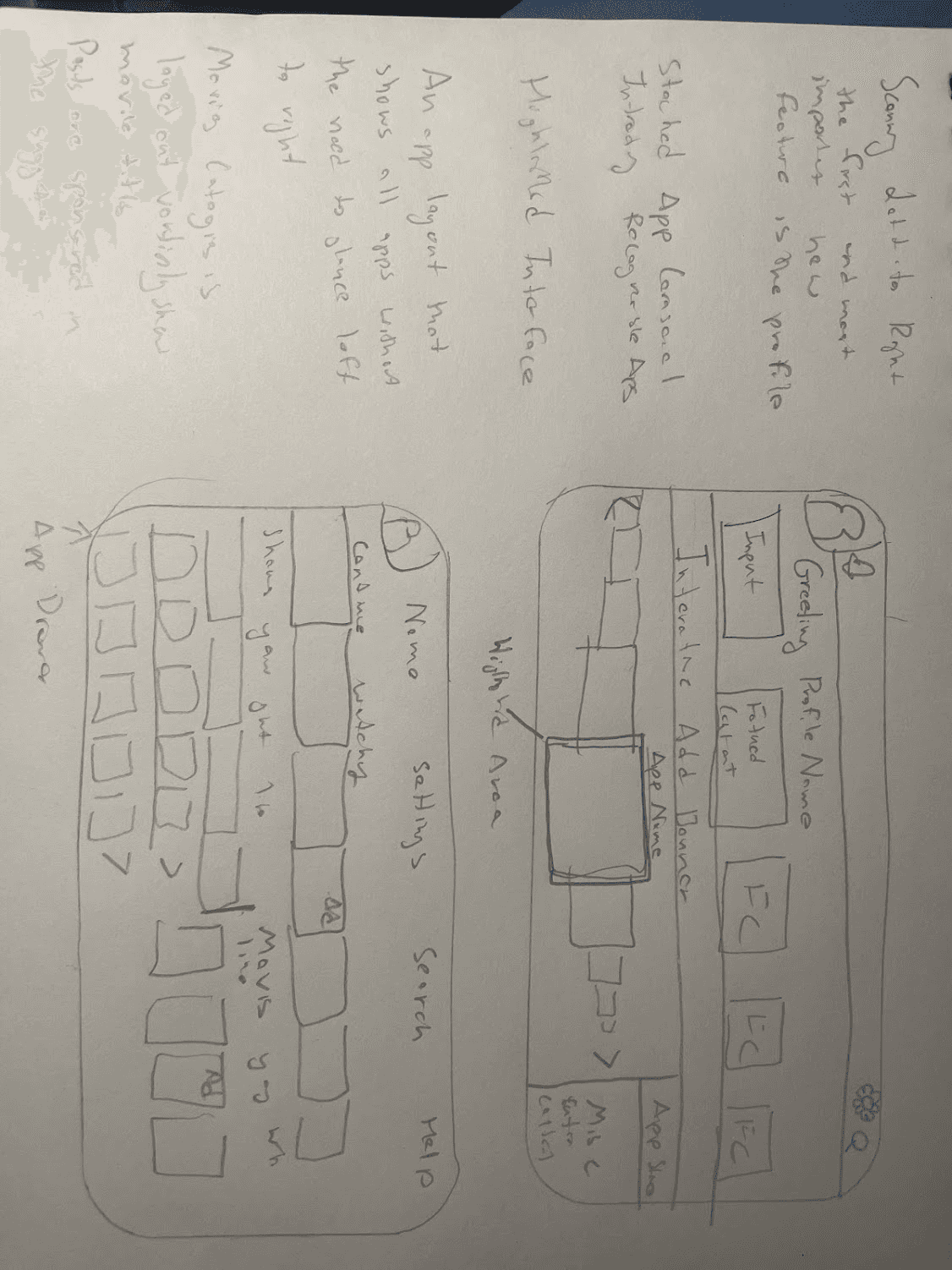
Sketches/Lofi/Hifi
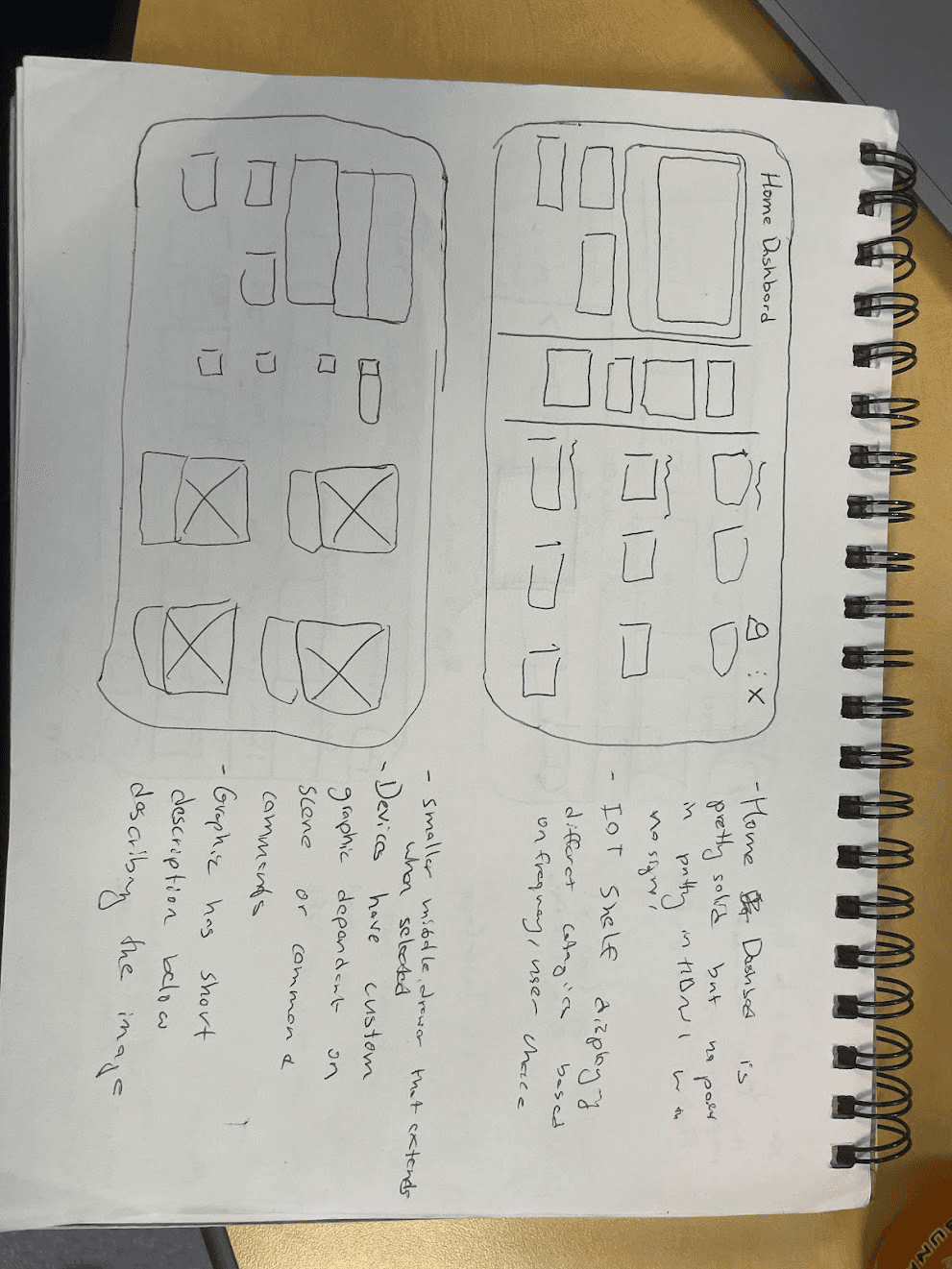
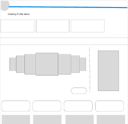
Grid System
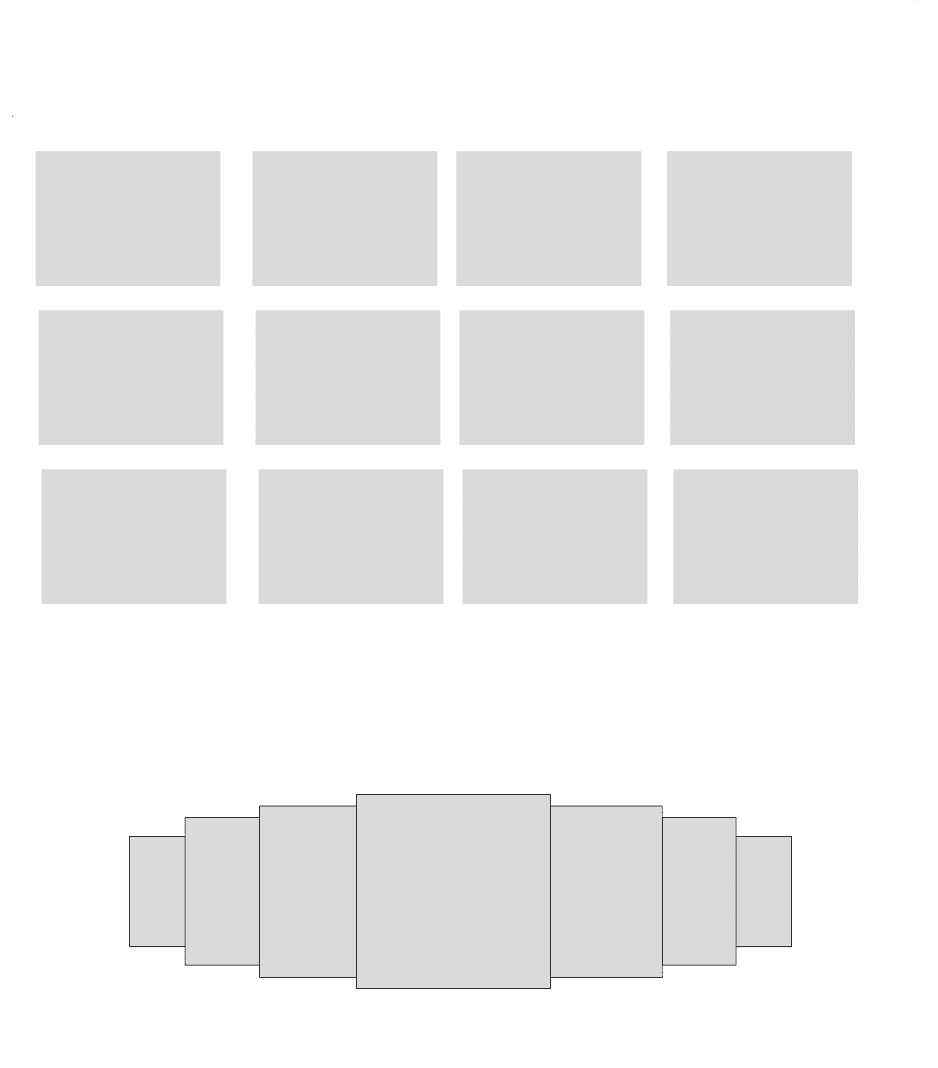
Rows
Count: 5
Type: Stretch
Margin 50
Gutter: 20
Columns
Count: 4
Type: Left
Gutter: 20
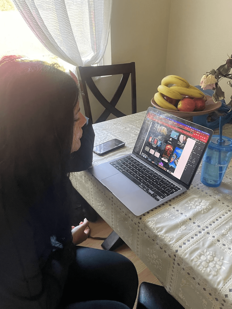
Chapter 3: Test and Analyze
5 second testing
Observations
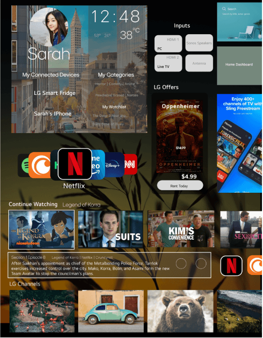
"First one looked like a tablet" -Particpant 1
"This one looked a laptop then a PC, the background looked too busy feels like a tablet"
Particpant 2 and 3 could tell it was an tv instantly. they both mentioned that they are familiar with a smart tv interface
"Too much nature background, too much thinking about other things"-P5
"You need to look around a lot to find things"-P6
Pain Points 5 seconds test
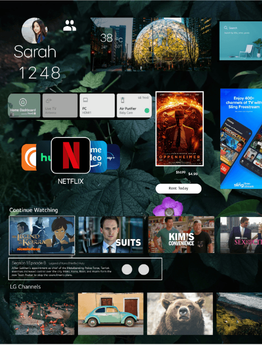
5 second changes
People frequently use and recognize inputs
People frequently use and recognize inputs
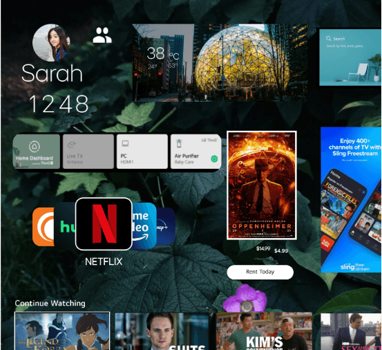
Personalized area now shows you recommendations and devices.
People frequently use and recognize inputs
Less distracting background image
People frequently use and recognize inputs
When items, objects or elements share superficial characteristics, we perceive them as grouped. We can see the similarity principle in branding and design system guidelines.
People frequently use and recognize inputs
Gestalt focused
People frequently use and recognize inputs
5 second changes
5 second changes
People Frequently recongize and use inputs
Personazlied area now shows you recomendations and devices.
Less distracting background image
Gestalt focused
When items, objects or elemnts share superficial characteristics, we perceive them as grouped. WE can see the simialry principle in branding and design system guidelines
Peer Review Changes
Rephrased to smart home "So what is IOT again?"
"the Oppenhemir card feels unfinished
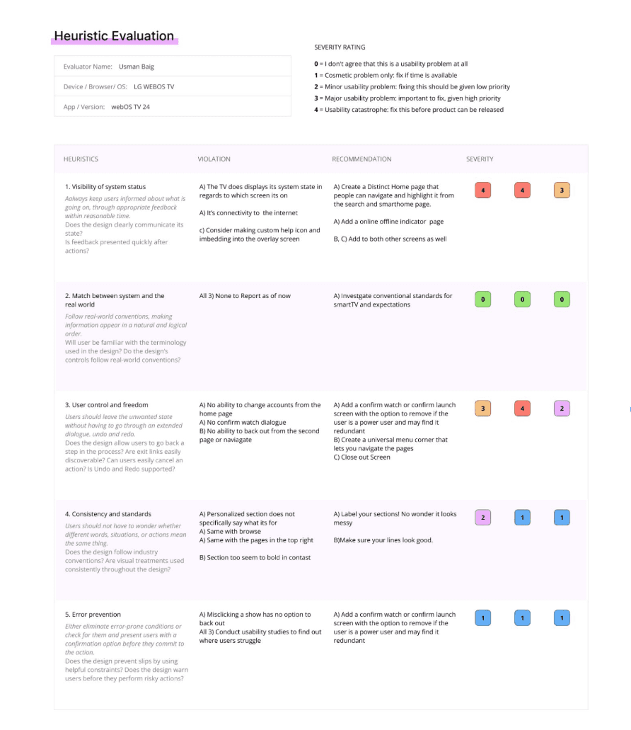
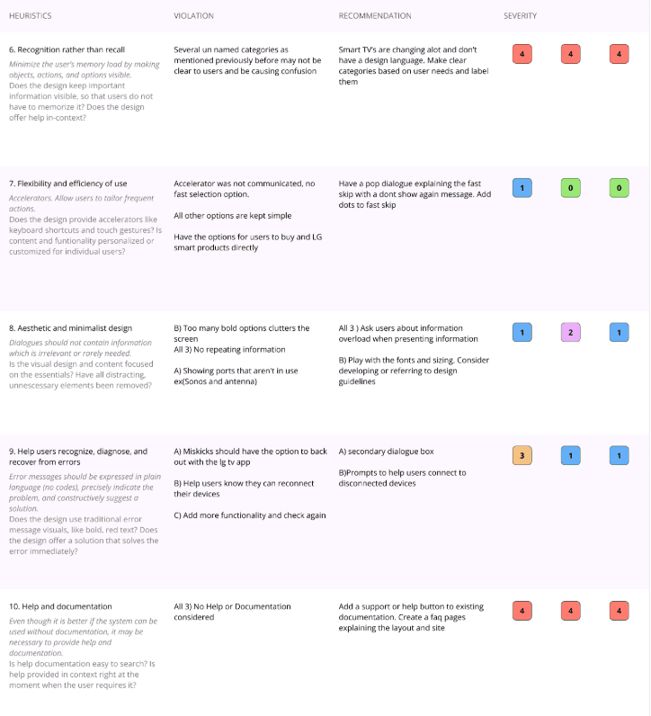
Severity Ranking Heuristic Evaluation Summary
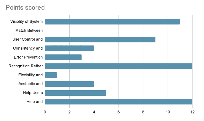
Severity Rankings can be used to help identify which user issues are the most relevant and should be addressed immediately.The heuristic evaluation ended up shedding a lot of light on things that I was not able to articulate when it came to the confusing and overwhelming content. 22 unique design violation were found with the document with 15 heuristic solutions approached. Some of the solutions overlap multiple design violations and should be prioritized. There was a heavy implication that the user would understand certain categories without labels which spanned over multiple sections.
Heuristic 1 System Status along with heuristic 2, Help and Documentation were overlooked in the design process and were added later .
Visability of System Status
Aesthic and Minimalist Design
Help users recoginze errors
User Control and Freedom
Help and Documentation
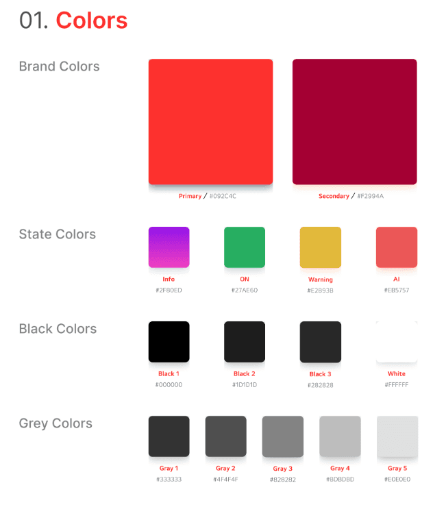
Left red for active, darker red for the background
Identifies system status
Cautiously use darker blacks to keep LG's commitment to accessibility
LG signature soul grey is the most used color